As an interior designer, I’ve seen firsthand how the right color choices can transform a house into a home. But the impact of color goes far beyond mere aesthetics.
The psychology of color in interior design is a fascinating field that combines art, science, and a deep understanding of human nature. In this post, we’ll explore how colors affect our mood, behavior, and overall well-being in our living spaces.
When I first started my career, I thought choosing colors was all about creating visually pleasing combinations. Little did I know that I was about to embark on a journey that would teach me how profoundly colors influence our daily lives. The psychology of color isn’t just a trendy concept; it’s a powerful tool that can shape our emotions, productivity, and even our sleep patterns.
From the calming blues of a serene bedroom to the energizing yellows of a vibrant kitchen, every color choice we make in our homes has the potential to impact our mental and emotional state. As we delve into this topic, I’ll share some of my most memorable projects and the lessons I’ve learned about harnessing the power of color in home decor.
The Basics of Color Psychology
Before we dive deep into the nuances of color psychology in home design, let’s brush up on some fundamentals.
Primary, Secondary, and Tertiary Colors
Remember the color wheel from your school days? It’s more than just a pretty circle. The primary colors (red, blue, and yellow) form the basis of all other colors. Secondary colors (green, orange, and purple) are created by mixing two primary colors. Tertiary colors are the result of mixing a primary and a secondary color.
In one of my earliest projects, I worked with a client who wanted to create a vibrant, artistic space. We used a large color wheel as a focal point in their living room, surrounded by furniture and decor that represented each color family. It was a bold choice, but it beautifully illustrated how colors relate to each other and created a truly unique space.
Warm vs. Cool Colors
Colors are often categorized as either warm or cool. Warm colors (reds, oranges, yellows) tend to evoke feelings of energy and comfort, while cool colors (blues, greens, purples) are often associated with calmness and serenity.
I once designed a home office for a writer who struggled with focus. By incorporating a palette of cool blues and greens, we created a space that promoted concentration and reduced stress. The transformation in her productivity was remarkable!
Color Associations and Cultural Differences
It’s crucial to remember that color associations can vary significantly across cultures. For instance, while white is often associated with purity and cleanliness in Western cultures, it’s a color of mourning in some Eastern cultures.
I learned this lesson the hard way when working on a project for an international client. What I thought was a cheerful yellow dining room turned out to be reminiscent of mourning in their culture. It was a humbling experience that taught me the importance of understanding and respecting cultural differences in color perception.
How do Colors Affect Our Mood and Behavior?
Now that we’ve covered the basics, let’s explore how different colors can influence our emotions and actions within our living spaces.
Emotional Responses to Different Colors
- Red: Stimulates energy and excitement. Perfect for dining rooms or exercise spaces.
- Blue: Promotes calmness and relaxation. Ideal for bedrooms or bathrooms.
- Yellow: Evokes happiness and optimism. Great for kitchens or home offices.
- Green: Symbolizes nature and renewal. Excellent for living rooms or meditation spaces.
- Purple: Associated with luxury and creativity. Suitable for artistic spaces or reading nooks.
I once worked with a couple who were constantly arguing in their home. We discovered that their living room, where they spent most of their time, was painted a bright, stimulating red. By changing it to a soothing sage green, we created a more harmonious environment that noticeably reduced their conflicts.
Impact on Productivity and Focus
Colors can significantly affect our ability to concentrate and be productive. For home offices or study areas, consider these options:
- Light Blue: Enhances focus and mental clarity.
- Green: Reduces eye strain and promotes concentration.
- Yellow: Stimulates creativity and optimism.
One of my favorite projects involved designing a home office for a graphic designer. We used a combination of light blue walls with pops of yellow in the decor. The result was a space that fostered both focus and creativity, leading to some of her best work yet.
Influence on Sleep Patterns
The colors in our bedrooms can have a profound impact on our sleep quality. Generally, cooler colors are more conducive to sleep. Here are some sleep-friendly color choices:
- Soft Blues: Promote relaxation and calmness.
- Muted Greens: Create a soothing, natural atmosphere.
- Warm Neutrals: Offer comfort without overstimulation.
I once helped a client who suffered from insomnia transform her bedroom. We replaced the bright white walls with a soft, muted lavender. The change was so effective that she reported falling asleep faster and enjoying more restful nights.
Color in Different Living Spaces
Each room in our homes serves a different purpose, and the colors we choose should reflect and enhance these functions.
Living Room
The living room is often the heart of the home, where we relax, entertain, and spend time with family. Aim for colors that create a welcoming and comfortable atmosphere:
- Warm Neutrals: Create a cozy, inviting feel.
- Soft Greens: Bring a touch of nature indoors.
- Light Blues: Promote relaxation and conversation.
One of my most successful living room designs used a palette of warm beige with accents of sage green and soft blue. The combination created a space that was both elegant and incredibly comfortable, perfect for both quiet evenings and lively gatherings.
Bedroom
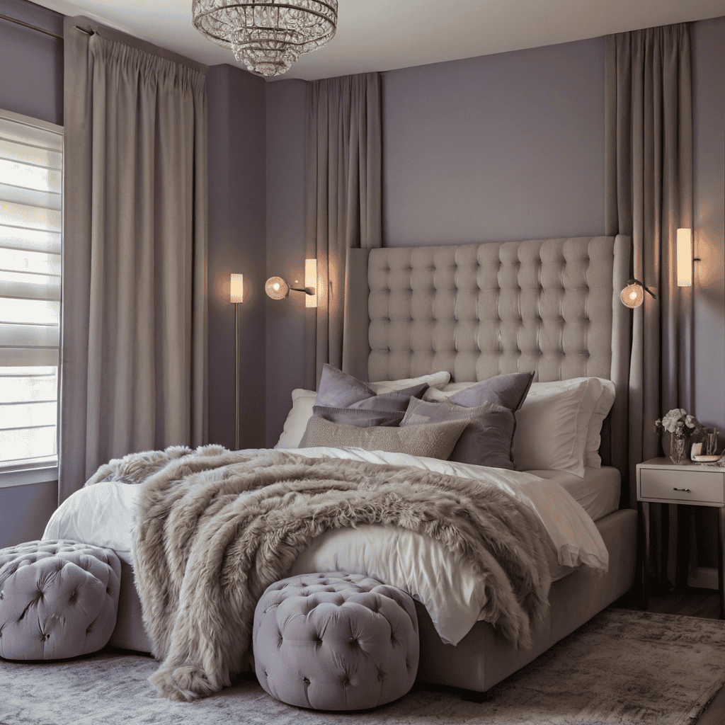
Your bedroom should be a sanctuary that promotes rest and relaxation. Consider these calming color options:
- Soft Lavender: Encourages relaxation and peaceful sleep.
- Pale Blue: Creates a serene, tranquil atmosphere.
- Warm Gray: Offers a neutral, soothing backdrop.
I once designed a bedroom for a busy executive who had trouble winding down at night. We chose a palette of soft lavender and warm gray, creating a cocoon-like space that helped her transition from work mode to relaxation as soon as she entered the room.
Kitchen
The kitchen is a hub of activity and should have colors that energize and inspire:
- Yellow: Promotes happiness and stimulates appetite.
- White: Creates a clean, fresh look.
- Green: Brings a natural, organic feel.
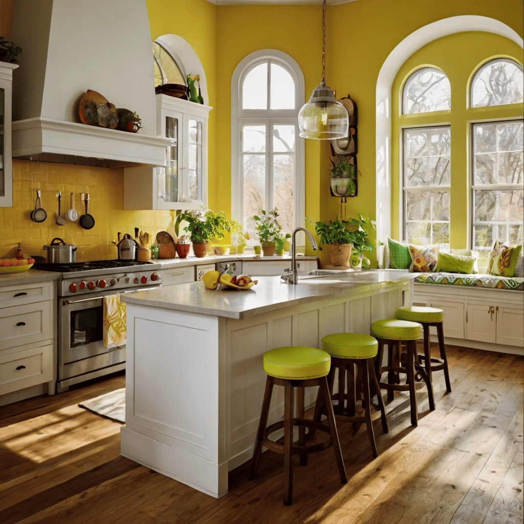
One of my favorite kitchen projects involved a combination of sunny yellow walls, crisp white cabinets, and pops of green in the form of plants and accessories. The homeowners reported feeling more energized and enjoying their time in the kitchen more than ever before.

Home Office
A home office should balance focus and creativity. Consider these color options:
- Navy Blue: Promotes productivity and professionalism.
- Green: Reduces eye strain during long work hours.
- Accents of Yellow or Orange: Stimulate creativity and energy.
I recently designed a home office for a freelance writer, using a sophisticated navy blue for the main walls, with a feature wall in a soft green. We added pops of yellow to the artwork and accessories. The result was a space that felt professional yet creative, helping her to stay focused and inspired throughout her workday.
Chromotherapy in Home Design
Now, let’s explore an often-overlooked aspect of color psychology in home design: chromotherapy.
Chromotherapy, also known as color therapy, is the practice of using color and light to adjust body vibrations to frequencies that result in health and harmony. While it might sound a bit new-age, the principles of chromotherapy can be effectively applied to home decor to create spaces that not only look good but also promote well-being.
History of Chromotherapy
Chromotherapy has roots in ancient Egyptian, Greek, and Chinese cultures. These civilizations believed that certain colors could activate healing processes in the body. In modern times, chromotherapy has evolved into a holistic healing method that uses the visible spectrum of light to improve physical and emotional well-being.
Implementing Chromotherapy Principles in Home Decor
Here are some ways to incorporate chromotherapy into your home:
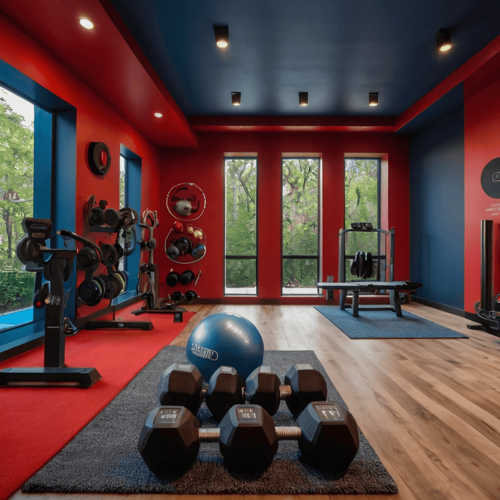
- Red: Use in areas where you want to stimulate energy and circulation. A red accent wall in a home gym can invigorate your workout routine.
- Blue: Ideal for spaces where you want to promote calmness and reduce blood pressure. Try blue in a meditation corner or reading nook.
- Yellow: Great for areas where you want to improve mood and stimulate mental activity. A yellow home office can boost creativity and focus.
- Green: Perfect for promoting balance and harmony. Use green in living areas to create a sense of renewal and connection with nature.

Case Studies and Personal Experiences
I once worked with a client who suffered from seasonal affective disorder (SAD). We incorporated principles of chromotherapy into her home office, using a light therapy lamp and a color-changing LED system. By simulating the warm hues of sunrise in the morning and cool, calming tones in the evening, we were able to help regulate her circadian rhythm and improve her mood throughout the changing seasons.
Another memorable project involved a yoga instructor who wanted to create a home studio that would enhance her practice and benefit her students. We used a combination of soothing blue-green walls with programmable LED lights that could change color based on the type of class she was teaching. The ability to shift the room’s color from energizing reds and oranges for power yoga to calming blues and purples for restorative sessions made a noticeable difference in the effectiveness of her classes.
Color and Biophilic Design
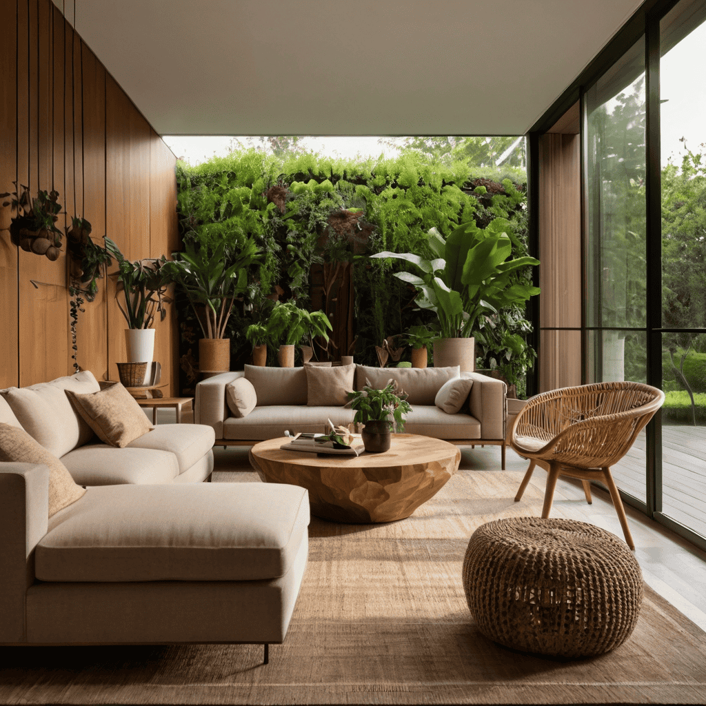

Biophilic design is an approach that seeks to connect building occupants more closely to nature. Color plays a crucial role in achieving this connection.
Connecting Color Choices to Nature
When incorporating biophilic design principles, choose colors that reflect the natural world:
- Earth Tones: Browns, tans, and warm greys can ground a space and create a sense of stability.
- Sky Blues: Light to medium blues can evoke feelings of openness and tranquility.
- Forest Greens: Various shades of green can bring the refreshing feel of nature indoors.
I recently worked on a project where we transformed a stark, modern apartment into a nature-inspired oasis. By using a palette of earthy browns, soft greens, and sky blues, we created a space that felt like an extension of the nearby park, bringing a sense of calm and connection to nature into the urban home.
Using Color to Enhance Indoor-Outdoor Flow
To create a seamless transition between indoor and outdoor spaces:
- Use similar color palettes in adjacent indoor and outdoor areas.
- Incorporate colors from your outdoor view into your interior design.
- Use glass doors or large windows to visually connect indoor and outdoor color schemes.
One of my favorite projects involved a beach house where we used the colors of sand, sea, and sky throughout the interior. The result was a home that felt like a natural extension of its beautiful coastal surroundings.
Incorporating Natural Elements to Complement Color Schemes
Bring in natural elements that complement your color choices:
- Wooden furniture or accents can warm up cool color schemes.
- Stone or pebble features can add texture to earth-toned rooms.
- Plants can enhance and enliven any color palette.
In a recent project, we complemented a palette of soft greens and blues with natural wood furniture, stone-textured wallpaper, and an abundance of indoor plants. The result was a space that felt alive, fresh, and deeply connected to nature.
Color for Neurodivergent Individuals
Designing spaces for neurodivergent individuals requires a thoughtful approach to color use. Whether you’re creating a space for someone with autism, ADHD, or other neurodivergent conditions, color choices can significantly impact comfort and functionality.
Tailoring Color Schemes for Individuals with Autism or ADHD
- For Autism: Many individuals with autism can be sensitive to bright or bold colors. Soft, muted colors are often more comfortable. Consider pale blues, soft greens, or gentle lavenders.
- For ADHD: While some with ADHD might benefit from calming colors, others might need more stimulating hues to maintain focus. It’s crucial to understand individual needs.
I once designed a bedroom for a child with autism. We used a very soft, muted blue for the walls, with white furniture and minimal patterns. The parents reported that their child seemed much more relaxed and slept better in the new environment.
Creating Calming Environments Through Color
- Use a monochromatic color scheme with subtle variations to create a sense of calm and order.
- Incorporate nature-inspired colors like soft greens and blues to promote relaxation.
- Consider using color to create designated zones for different activities.
In a project for a family with a child with ADHD, we designed a study area using a calming green for focus but included a small “movement zone” with more energizing colors where the child could take active breaks.
Avoiding Overstimulation with Strategic Color Use
- Limit the use of bright, bold colors to small accents rather than large areas.
- Use color to create clear visual boundaries between different functional areas.
- Consider using colored lighting that can be adjusted based on needs and activities.
One particularly successful project involved creating a sensory room for a child with autism. We used neutral colors for the main space but incorporated color-changing LED lights and projectors. This allowed the child’s parents to adjust the color environment based on their child’s needs at any given time.
The Role of Lighting in Color Perception
The way we perceive color is intrinsically linked to lighting. Understanding this relationship is crucial for successful interior design.
Natural vs. Artificial Light
Natural light changes throughout the day, affecting how colors appear:
- Morning light tends to be soft and warm, enhancing warm colors.
- Midday light is cooler and brighter, showing colors in their truest form.
- Evening light is often warm and golden, intensifying warm tones.
Artificial light sources also affect color perception:
- Incandescent bulbs cast a warm, yellow light that enhances warm colors but can dull cool ones.
- Fluorescent lights tend to have a cool blue cast that can make warm colors appear dull.
- LED lights come in a range of color temperatures and can be chosen to enhance your color scheme.
I once worked in a dining room that looked perfect during the day but felt off in the evening. We realized the warm incandescent lighting was intensifying the already warm color scheme. By switching to adjustable LED lighting, we were able to balance the color temperature and maintain the intended look throughout the day.
How Lighting Affects Color Appearance
- Light Reflectance Value (LRV): This measures how much light a color reflects. Higher LRV colors will appear brighter and can help illuminate a space.
- Undertones: These subtle hues within a color become more apparent under certain lighting conditions.
- Metamerism: This phenomenon occurs when colors appear to match under one light source but not under another.
Understanding these concepts can help you choose colors that will look good under various lighting conditions. In one project, we chose gray paint for a living room, but it appeared blue under the existing lighting. By testing samples under different light sources, we were able to find a truly neutral gray that maintained its appearance throughout the day.
Tips for Choosing Colors Based on Room Lighting
- Always test paint samples in the room where they’ll be used, observing them at different times of day.
- Consider the direction your windows face: north-facing rooms receive cooler light, while south-facing rooms get warmer light.
- Use lighting to enhance or correct color schemes: warm lighting can balance cool colors, while cool lighting can temper overly warm schemes.
In a recent bedroom project, we chose a soft green that looked perfect during the day but appeared dull at night. By adding warm LED strip lighting behind the headboard, we were able to enhance the color and create a cozy atmosphere in the evenings.
Color Trends vs. Timeless Color Choices
As an interior designer, I’m often asked about balancing current trends with timeless appeal. Here’s my perspective on navigating color trends while creating lasting beauty in your home.
Current Color Trends in Home Decor
Color trends can be a great source of inspiration, but it’s important to use them judiciously. Some current trends include:
- Earth Tones: Warm browns, terracottas, and sage greens are having a moment.
- Jewel Tones: Rich emeralds, sapphires, and amethysts add luxury and depth.
- Pastels: Soft, muted versions of colors are popular for their calming effects.
While working on a recent living room project, we incorporated the trendy earth tone palette but in a way that could easily be updated in the future. We used these colors in easily changeable elements like throw pillows and artwork, keeping larger pieces neutral.
Evergreen Color Schemes
- Earthy Neutrals: Combinations of beige, taupe, and warm greys create a timeless, natural feel.
- Monochromatic Schemes: Using various shades of the same color creates depth and interest without dating quickly.
I once designed a living room using a monochromatic scheme of warm greys. We used textures and subtle pattern variations to add interest. Years later, the space still looks sophisticated and current, proving the enduring appeal of this approach.
Balancing Trendy and Classic Color Choices
The key to a timeless yet fresh interior is striking the right balance between trend-forward and classic color choices. Here’s how to achieve this:
- Use trendy colors in easily changeable elements: Throw pillows, Area rugs, Artwork, and Small decorative objects
- Keep larger, more permanent elements in classic colors: Walls, Large furniture pieces, and Flooring
- Consider the 80/20 rule: Use classic colors for 80% of your space, and trendy colors for the remaining 20%.
- Choose a timeless base color and accent with trending hues.
One of my most successful projects involved a living room where we used a classic neutral grey for the walls and larger furniture pieces. We then incorporated the trendy colors of the moment – at that time, it was coral and teal – in the throw pillows, artwork, and a statement armchair. When those colors fell out of fashion, the homeowners could easily update the look without a major overhaul.
Remember, your home should reflect your personal style more than fleeting trends. I always advise my clients to choose colors they genuinely love, regardless of what’s currently in vogue. If you adore a color, you’re more likely to enjoy it for years to come.
Practical Tips for Incorporating Color Psychology in Home Decor
Now that we’ve explored the theory behind color psychology in home decor, let’s discuss how to put these ideas into practice.
1. Color Selection Process
- Assess the room’s purpose: What activities will take place here? What mood do you want to create?
- Consider the room’s natural light: How much light does the room receive, and from which direction?
- Take stock of existing elements: What colors are already present in flooring, furniture, or architectural features?
- Think about your color preferences: Which colors make you feel good? Which ones do you dislike?
- Use color psychology principles: Refer back to the emotional associations of different colors we discussed earlier.
I remember working with a client who wanted to create a home office that would inspire creativity but also help her focus. We started by assessing the room’s purpose, considering the natural light (it was north-facing), and taking into account her preference for cool colors. We ended up choosing a soft blue-green for the walls, which promoted both calm and creativity and added energizing pops of yellow to the decor.
2. Testing Colors Before Committing
Always test your colors before making a final decision. Here’s how:
- Paint large swatches (at least 2 feet square) on multiple walls in the room.
- Observe the swatches at different times of day and under various lighting conditions.
- Live with the swatches for at least a few days to see how you feel about them over time.
- Consider how the colors interact with your furniture and decor.
In one project, my client was convinced she wanted a warm terracotta for her living room. But after testing it, she realized it made the space feel smaller and darker than she liked. We ended up choosing a lighter, more neutral tone that still had warm undertones, creating the cozy feel she wanted without overwhelming the space.
3. Gradual Introduction of New Colors
If you’re nervous about introducing bold new colors, start small:
- Begin with neutral walls and add color through accessories.
- Use the new color in a small area, like an accent wall, before committing to an entire room.
- Introduce color through artwork or textiles before painting.
- Consider using colored lighting to experiment with different hues.
I once worked with a couple who were color-shy but wanted to liven up their all-white living room. We started by introducing soft blue throw pillows and a piece of artwork with blue tones. As they grew more comfortable, we added a blue armchair and finally painted one wall a beautiful sky blue. The gradual approach allowed them to adjust to the change and ended up with a room they loved.
Conclusion
As we’ve explored throughout this post, the psychology of color in home decor goes far beyond mere aesthetics. The colors we choose for our living spaces have the power to influence our moods, behaviors, and overall well-being.
From the calming blues of a serene bedroom to the energizing yellows of a creative home office, every color choice we make contributes to the atmosphere and functionality of our homes.
Remember, while color psychology provides valuable insights, personal preferences and individual experiences with color are equally important. Your home should be a reflection of you, a place where you feel comfortable, inspired, and truly at home.
As an interior designer, I’ve seen firsthand how transformative the right color choices can be. I’ve witnessed rooms go from dull to dynamic, from chaotic to calm, all through the thoughtful application of color. But more importantly, I’ve seen how these changes positively impact the lives of the people living in these spaces.
So, I encourage you to experiment with color in your home. Be bold, be creative, but most of all, be true to yourself. Use the principles of color psychology as a guide, but let your personal style shine through. After all, the most beautiful homes are those that tell the unique story of the people who live there.
Whether you’re planning a major renovation or just looking to refresh a room, I hope this exploration of color psychology has inspired you to think more deeply about your color choices.
Remember, your home is your canvas, and color is one of your most powerful tools. Use it wisely, use it creatively, and watch as your living spaces transform into environments that not only look beautiful but feel wonderful to live in.
Happy decorating!

