As an interior designer, I’ve seen firsthand how the right color palette can transform a house into a home. Connecting colors isn’t just about aesthetics; they set the mood, define spaces, and reflect your personality.
But with millions of color options available today, how do you choose the perfect combination for your space?
Enter the 60-30-10 rule – a game-changer in the world of interior design. In this article, I’ll guide you through the basics of color theory and show you how to apply this rule to create stunning, harmonious interiors that you’ll love coming home to.
The Foundations of Color Theory
Before we dive into the 60-30-10 rule, let’s brush up on some color basics. Trust me, understanding these concepts will make you feel like a pro when you’re picking out your next paint swatches!
The Color Wheel:
Your New Best Friend Picture this: a circular rainbow that’s actually a powerful tool for designers. That’s our color wheel. It’s not just pretty to look at; it’s the key to unlocking perfect color combinations. Here’s a quick breakdown:

Primary Colors:
These are the building blocks – red, blue, and yellow. You can’t create these by mixing other colors, but they’re the foundation for everything else.


Secondary Colors:
Mix two primary colors, and voilà! You get secondary colors. Orange, green, and purple are the stars here.


Tertiary Colors:
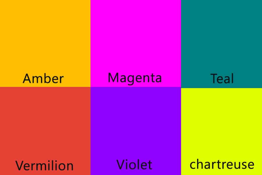
These are the in-betweeners. Mix a primary with a secondary color, and you’ll get shades like amber, vermillion, and chartreuse. They’re perfect for adding depth to your color scheme.

Color Combining Methods: Your Design Toolkit
Now that we’ve got the basics down, let’s talk about how to mix and match these colors in your home. I’ve used these methods countless times to create spaces that truly wow my clients:
Complementary Color Mixing:
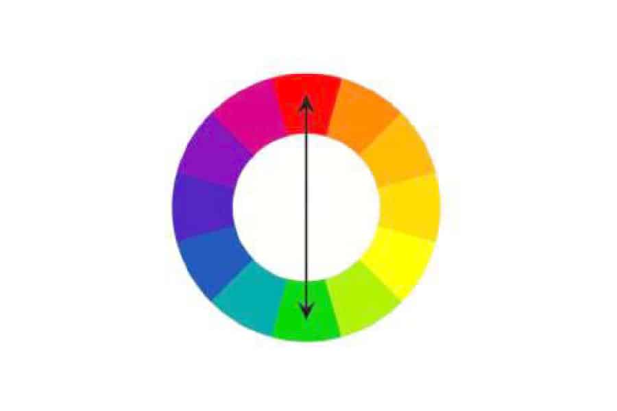
Want to make a statement that turns heads? Pair colors from opposite sides of the color wheel, like the dynamic duo of blue and orange or the striking contrast of purple and yellow. This approach is bold, it’s daring, and when executed with care, it can transform a space into something absolutely breathtaking. Complementary colors bring out the best in each other, making your design pop with energy and life.

Analogous Color Mixing:
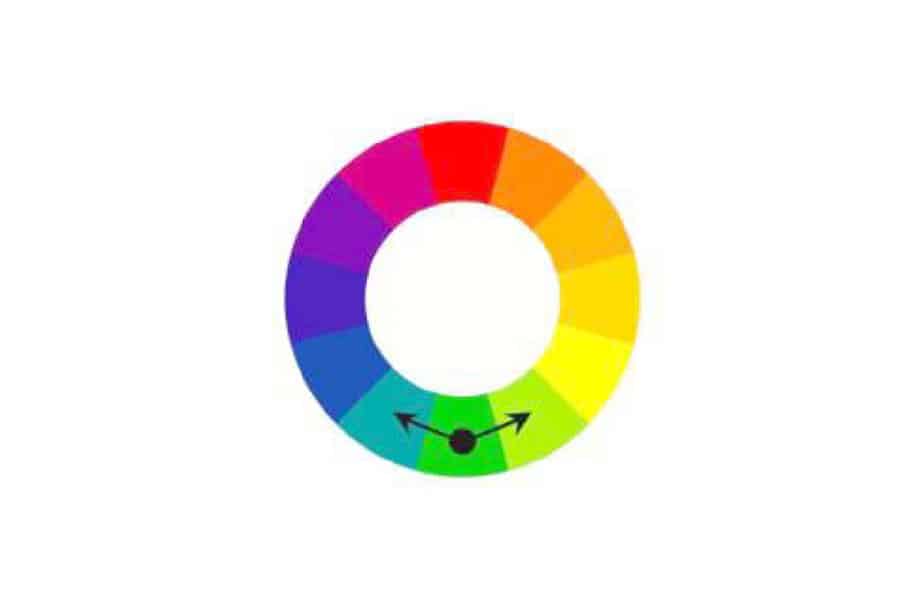
If you’re aiming for a more harmonious, calming atmosphere, look no further than analogous color schemes. By choosing colors that sit side by side on the wheel—think green, blue-green, and blue—you can create a space that feels like a serene oasis. These color combinations flow seamlessly, evoking a sense of peace and tranquility that’s perfect for bedrooms, bathrooms, or any space where you want to unwind.

Monochromatic Color Mixing:
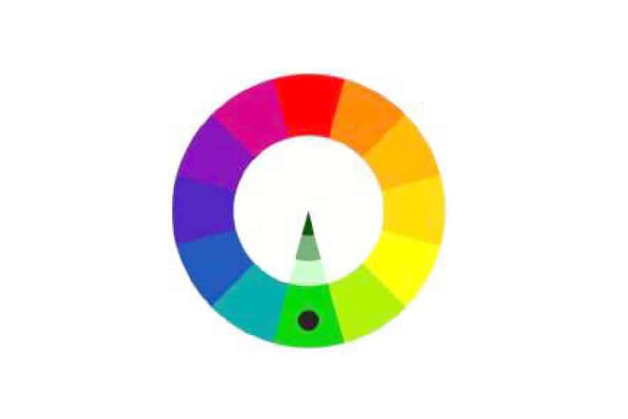
Never underestimate the power of a single color! By playing with different shades, tints, and tones of one hue, you can create a sophisticated, cohesive look that’s anything but boring. Monochromatic schemes offer a subtle yet powerful way to add depth and interest to a room, allowing you to highlight textures, patterns, and architectural details without overwhelming the eye.

Split Complementary Mixing:
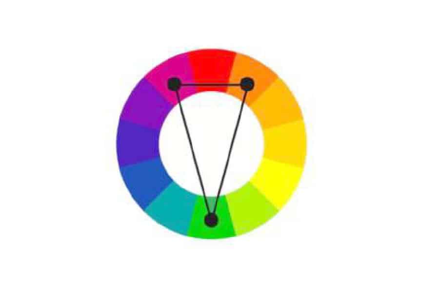
This is one of my go-to strategies for adding a touch of flair without going overboard. Start with one base color, then pair it with the two colors adjacent to its complement. It’s a perfect way to inject some excitement into your design while maintaining balance. This approach adds a nuanced contrast that’s both visually appealing and easy to live with, making it ideal for those who want a bit of drama without the full intensity of complementary colors.

Triadic Mixing:
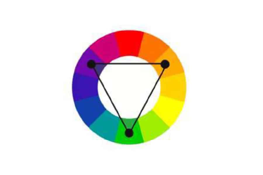
For those who crave vibrancy and balance in equal measure, triadic color schemes are the way to go. By selecting three colors evenly spaced around the color wheel, you create a lively, dynamic palette that’s sure to make an impression. It’s a bold choice that’s perfect for anyone looking to infuse their space with energy and personality, while still maintaining a sense of harmony.

The 60-30-10 Rule: Your Secret Weapon
Now, let’s get to the star of the show – the 60-30-10 rule. This isn’t just some arbitrary guideline; it’s a tried-and-true formula that I’ve used to create balanced, visually appealing spaces time and time again.
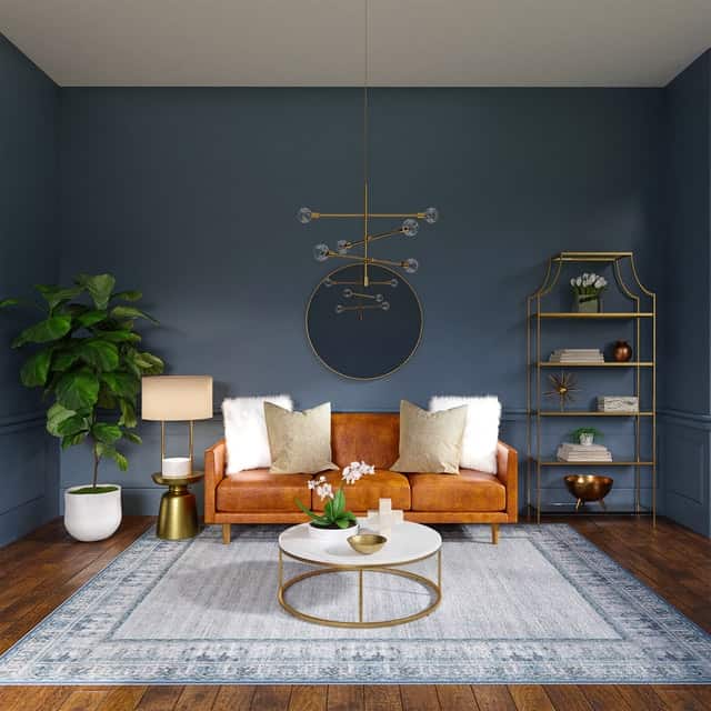

Here’s how it works:
- 60% is your dominant color
- 30% is your secondary color
- 10% is your accent color
Let’s break it down:
The 60%: Your Dominant Color This is typically your walls, large pieces of furniture, or flooring. It’s the backdrop of your room. I often go for neutral tones here – think warm greys, soft whites, or gentle beiges. They’re versatile and create a perfect canvas for the rest of your design.
The 30%: Your Secondary Color This is where you can start to have some fun. Use this color for smaller furniture pieces, curtains, or an accent wall. It should complement your dominant color while adding some personality to the space.
The 10%: Your Accent Color Here’s where you can really let loose! This is for your accessories – throw pillows, artwork, or that quirky lamp you couldn’t resist. It’s a great place to add a pop of vibrant color that ties the whole room together.
Practical Application: Bringing the 60-30-10 Rule to Life
Let’s put this into practice. Imagine we’re designing a living room together:
- 60% – Soft grey walls and a plush grey sofa (dominant color)
- 30% – Navy blue curtains and armchairs (secondary color)
- 10% – Yellow throw pillows, a piece of artwork, and a table lamp (accent color)
Can you picture it? The grey provides a calming backdrop, the navy adds depth and sophistication, and the yellow brings in that energizing pop of color. It’s balanced, it’s beautiful, and it feels like home.
Color Psychology: The Hidden Influence
As an interior designer, I’m always thinking about how colors affect our moods and behavior. Here’s a quick rundown:
- Blues and greens can be calming – perfect for bedrooms or bathrooms
- Yellows and oranges are energizing – great for kitchens or home offices
- Reds can stimulate conversation – consider them for dining rooms
- Purples often feel luxurious – lovely for a master bedroom or formal living area
Remember, these are guidelines, not rules. The most important thing is how the colors make you feel in your space.
Choosing Your Color Palette: A Step-by-Step Guide
Now that we’ve covered the basics, let me walk you through my process of selecting a color palette for a room. It’s a bit like being a color detective!
- Consider the Flow: Remember, rooms don’t exist in isolation. Think about how your color choices will flow from one room to the next.
- Start with Inspiration: Look around the room. Is there a piece of art, a rug, or a fabric that you absolutely love? Use that as your jumping-off point. I once designed an entire living room based on a client’s favorite painting of a sunset.
- Consider the Room’s Purpose: An energizing home office needs a different palette than a relaxing bedroom. Think about how you want to feel in the space.
- Test, Test, Test: Never trust a tiny paint chip! Get sample pots and paint large swatches on your wall. Live with them for a few days, observing how they look in different lights.
- Don’t Forget the Finish: Matte, eggshell, satin, or gloss – the sheen of your paint can dramatically affect how the color looks. Generally, I use matte finishes for walls and leave the glossier finishes for trim.
Common Color Mistakes and How to Avoid Them
In my years of designing, I’ve seen (and, let’s be honest, made) plenty of color mistakes. Here are a few common ones to watch out for:
- Ignoring Undertones: That “neutral” grey might have a hidden blue or green undertone that clashes with your other choices. Always compare colors side by side in the actual space.
- Playing it Too Safe: I’ve had clients who are so afraid of color that they end up with a completely beige home. Don’t be afraid to inject some personality!
- Following Trends Blindly: Remember millennial pink? Trends come and go. Choose colors you love and that reflect your personal style.
- Forgetting About Texture: Color isn’t just about hue. Texture can add depth and interest to your color scheme. Mix up shiny and matte finishes, and smooth and rough textures.
- Overlooking White: Not all whites are created equal. A bright white in one room might look dingy next to a different white in the adjoining space. Always compare whites side by side.
Color in Small Spaces: Making the Most of What You’ve Got
Working with a small space? Don’t worry, color can be your best friend! Here are some tricks I use to make small spaces feel larger and more inviting:
- Use Color to Define Areas: In open-plan spaces, use color to delineate different areas. A change in wall color or a colorful rug can define a dining area in a large living space.
- Go Monochromatic: Using different shades of the same color can create a sense of flow and make a space feel larger. I once used various shades of blue in a tiny studio apartment, and it felt like stepping into a serene ocean.
- Use Light Colors: Light colors reflect more light, making a space feel more open. But don’t be afraid of dark colors either…
- Dark Colors Can Work Too: A deep, rich color can make a small room feel cozy and intimate. I’ve used dark navy in small bedrooms to create a nest-like feel.
- Don’t Forget the Ceiling: The ceiling is your fifth wall! A pale blue or soft grey can make the ceiling feel higher.
Bringing It All Together: A Real-Life Example
Let me share a recent project that really brought the 60-30-10 rule to life. I was working on a living room for a young couple who loved the beach but lived in the city. Here’s how we used color to bring their coastal dreams home:
- 60% – We painted the walls a soft, sandy beige. This neutral backdrop reminded them of the beach and provided a versatile base.
- 30% – For the secondary color, we chose a calming sea blue. This appeared in the curtains, a large area rug, and some of the throw pillows on the sofa.
- 10% – Our accent color was coral red, inspired by sea coral. This popped up in art pieces, a statement lamp, and a few smaller accessories.
The result? A room that felt both energizing and relaxing, with just the right balance of color. The couple said walking into the room felt like taking a mini-vacation!
Lighting: The Game Changer
Folks, let me tell you a secret that’s hiding in plain sight: lighting is the unsung hero of interior design. It’s not just about banishing shadows; it’s about sculpting the very atmosphere of your space. As a designer, I’ve seen countless “perfect” color schemes fall flat under poor lighting, and I’ve witnessed ordinary rooms transform into extraordinary spaces with the right illumination. Let’s shed some light on this crucial aspect of design, shall we?
Natural Light:
Nature’s Color Revealer There’s a reason why I always insist on visiting a space at different times of the day before finalizing a color scheme. Natural light is fickle, and it can dramatically alter how your colors appear:
- North-facing rooms: These spaces receive cool, diffused light all day. Warm colors can help counteract the coolness, while cool colors might end up looking drab.
- South-facing rooms: Blessed with warm light throughout the day, these spaces can handle both cool and warm tones beautifully.
- East-facing rooms: Bright and warm in the morning, cooler in the afternoon. Consider how you use the room at different times of the day.
- West-facing rooms: These rooms are cooler in the morning and warmer in the afternoon. Again, think about when you’ll be using the space most.
Artificial Lighting:
You are A Color Chameleon Now, let’s talk about what happens when the sun goes down. Different types of artificial light can have a huge impact on your carefully chosen color palette:
Incandescent lighting:
This traditional lighting casts a warm, yellowish glow. It enhances warm colors and can make cool colors appear a bit muddy.
Fluorescent lighting:
Known for its cool, bluish tint, fluorescent lights can make warm colors look washed out. However, they’re great for enhancing cool tones.
LED lighting:
The chameleon of the lighting world! LEDs come in a range of color temperatures, from warm to cool. I always recommend choosing LEDs with a high CRI (Color Rendering Index) for the most accurate color representation.
Halogen lighting:
Similar to natural daylight, halogen bulbs render colors quite accurately. They’re great for task lighting in areas where color accuracy is crucial, like home offices or art studios.
Layering Your Lighting Here’s a pro tip: don’t rely on a single light source. Layering your lighting not only adds depth to your space but also allows you to adjust the mood and color perception. I always incorporate these three types of lighting:
Ambient lighting:
This is your general, overall illumination. Think ceiling fixtures or recessed lights.
Task lighting:
Focused lighting for specific activities, like reading lamps or under-cabinet kitchen lights.
Accent lighting:
The fun part! Use this to highlight architectural features, and artwork, or to add drama to your space.
The Magic of Dimmers:
I can’t stress this enough: install dimmers wherever you can. They’re not just for creating romantic ambiance (though they’re great for that too!). Dimmers allow you to adjust the intensity of your lighting, which in turn affects how your colors appear. Plus, they’re a lifesaver when you want bright light for cleaning but softer light for relaxing.
Before you commit to a color scheme,
Here’s what I always do with my clients:
- Paint large swatches on different walls in the room.
- Observe these swatches at different times of day and under various lighting conditions.
- Use the actual light fixtures you plan to have in the space.
- Live with these swatches for a few days before making your final decision.
Remember, what looks perfect in the paint store under their lighting might look completely different in your home. I once had a client who fell in love with a “perfect greige” in the store, only to find it looked decidedly pink in her north-facing living room!
The Bottom Line Lighting and color are dance partners in the grand ballroom of interior design. One cannot shine without the other. So as you embark on your color journey, don’t forget to give lighting its moment in the spotlight. Trust me, your beautifully curated color palette will thank you for it!
Conclusion: Your Home, Your Colors!
The 60-30-10 rule is a fantastic starting point but remember – rules are made to be broken. Trust your instincts, choose colors that speak to you, and don’t be afraid to experiment. After all, this is your home we’re talking about!
I hope this guide has inspired you to play with color in your space. Remember, interior design is as much about feeling as it is about looking good. So go ahead, grab those paint swatches, and start creating a home that truly reflects you.
Happy designing!

