As an interior designer, I’ve come to realize that lighting is the unsung hero of any space. It’s not just about illumination; it’s about creating atmosphere, influencing mood, and even affecting our well-being.
Today, I want to delve into a fascinating aspect of lighting design that often goes unnoticed but plays a crucial role in how we perceive and feel in our environments: the psychology of color temperature.
Introduction: Color Temperature in Interior Lighting
Imagine walking into a room bathed in a warm, golden glow. You immediately feel relaxed, cozy, and ready to unwind. Now picture entering a space filled with bright, crisp light. Suddenly, you’re alert, focused, and ready to tackle the day. This stark difference in your reaction is the power of color temperature in action.
Color temperature in lighting refers to the warmth or coolness of light emitted by a bulb, measured in Kelvin (K). It’s a concept that goes beyond mere aesthetics; it profoundly impacts our psychological and physiological responses to our environment.
As designers, understanding and harnessing the power of color temperature allows us to create spaces that not only look beautiful but also support the well-being and activities of the people who inhabit them.
Understanding Color Temperature
To truly grasp the concept of color temperature, we need to understand the Kelvin scale. This scale ranges from about 1,000K to 10,000K, with lower numbers indicating warmer light and higher numbers representing cooler light.
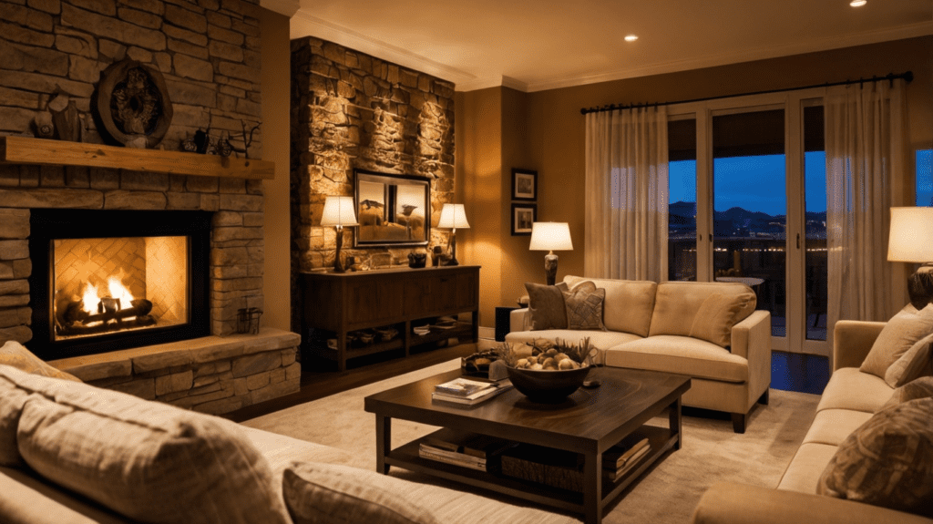
Warm light (2000K-3000K) mimics the glow of candlelight or a cozy fireplace. It creates a sense of intimacy and relaxation, perfect for living rooms or bedrooms. I often use this range when designing spaces meant for unwinding or social gatherings.
Cool light (4600K-6500K), on the other hand, is reminiscent of a bright, clear day. It promotes alertness and is ideal for task-oriented spaces like offices or kitchens. In a recent project for a tech startup, I used cool lighting in their main work areas to enhance focus and productivity.
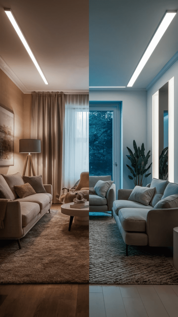

Natural light, interestingly, varies in color temperature throughout the day. Dawn and dusk provide warm light, while the midday sun offers cooler tones. This natural variation plays a crucial role in regulating our circadian rhythms, a concept we’ll explore more later.
The Psychological Effects of Different Color Temperatures
The psychological impact of color temperature is profound and far-reaching. Let’s break it down:
- Warm light (2000K-3000K) has a calming effect on our psyche. It creates a sense of comfort and intimacy, encouraging relaxation and social interaction. In a recent residential project, I used warm lighting in the living room to create a cozy atmosphere that the family loved for their evening gatherings.
- Neutral light (3100K-4600K) strikes a balance between warm and cool. It’s versatile and can work well in multi-purpose spaces. For a home office that doubled as a guest room, I chose neutral lighting to accommodate both focused work and relaxed hospitality.
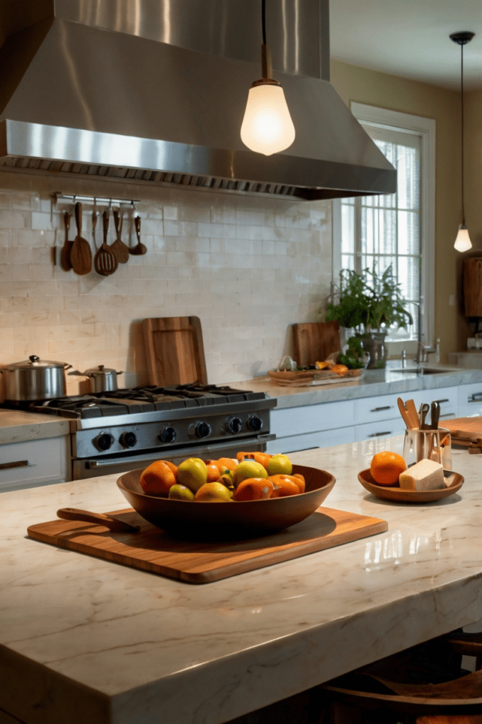
- Cool light (4600K-6500K) promotes alertness and can enhance mood, especially during darker winter months. It’s excellent for spaces where tasks requiring concentration are performed. In a kitchen remodel, I installed cool lighting over the cooking and prep areas to support precise food preparation.

Color Temperature and Circadian Rhythms
Our bodies have evolved to respond to the natural light cycle of the sun, with warm light in the mornings and evenings, and cooler light during the day. This cycle regulates our circadian rhythms, influencing sleep patterns, hormone production, and overall well-being.
As designers, we can support these natural rhythms through thoughtful lighting choices. I’ve been increasingly incorporating human-centric lighting systems in my designs. These systems automatically adjust color temperature throughout the day to mimic natural light patterns.
In a recent project for a client who worked night shifts, we installed a smart lighting system that gradually shifted from cool to warm light in the evening, helping them wind down for sleep despite the unconventional schedule.

Color Temperature in Different Interior Spaces
Different spaces in a home or office require different approaches to color temperature:
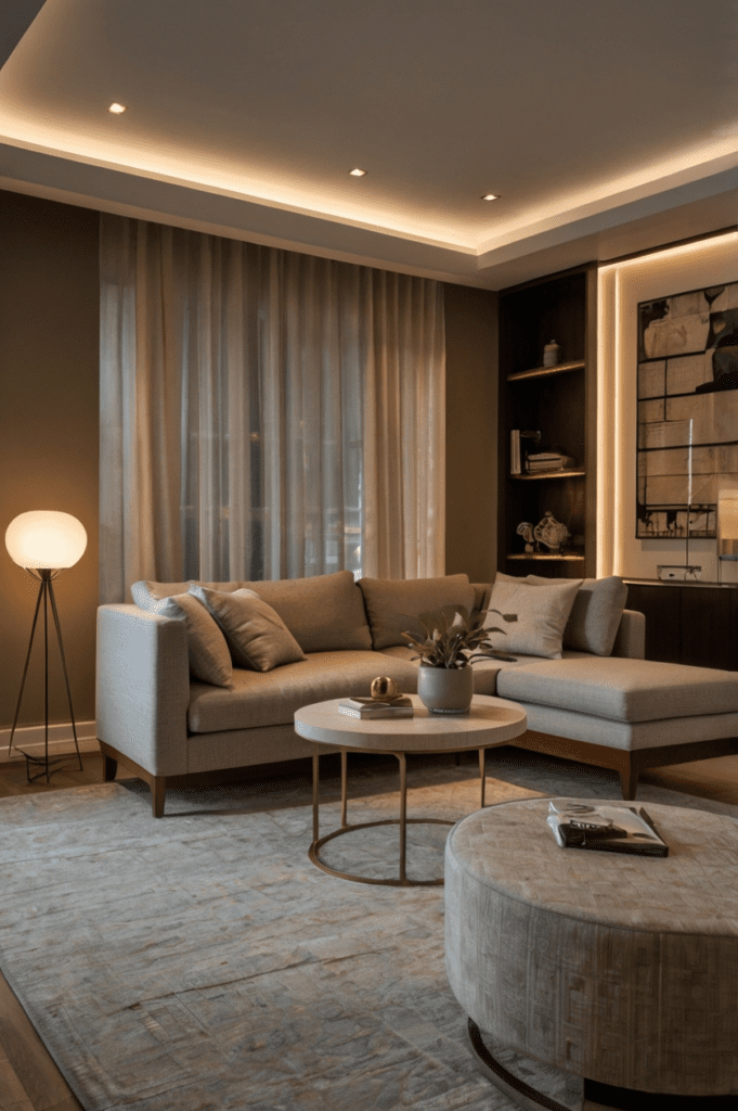
- Living rooms and relaxation areas benefit from warm lighting (2700K-3000K) to create a cozy, inviting atmosphere. In a recent living room design, I used a combination of warm overhead lighting and table lamps to create layers of comforting light.
- Kitchens and dining spaces often work well with a mix of color temperatures. I usually opt for cooler light (4000K-5000K) in food prep areas for clarity and safety, while using warmer light (2700K-3000K) over dining areas to enhance the appearance of food and create a pleasant dining atmosphere.
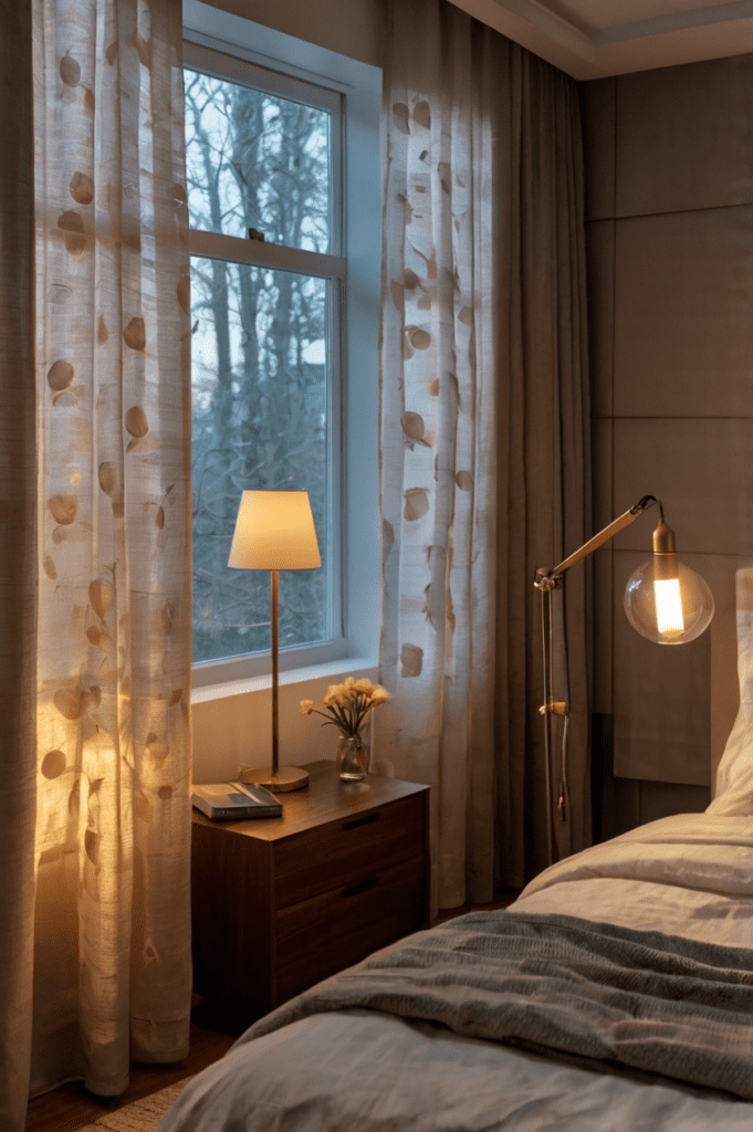
- Bedrooms require careful consideration of color temperature to support good sleep hygiene. I often use warm light (2400K-2700K) with dimming capabilities. In a recent master bedroom redesign, we installed a smart lighting system that gradually shifted from cool to warm light in the evening, mimicking the natural sunset and promoting better sleep.
- Home offices need lighting that supports productivity without causing eye strain. I typically use cooler light (4000K-5000K) in these spaces. For a client who worked long hours from home, we installed an adjustable desk lamp that could shift from cool to warm light, allowing them to transition from work mode to relaxation in the same space.
- Bathrooms often benefit from layered lighting with different color temperatures. I usually use cooler light (4000K-5000K) around mirrors for accurate grooming, and warmer light (2700K-3000K) for ambient lighting to create a spa-like atmosphere.
Cultural Differences in Color Temperature Preferences
It’s fascinating to observe how lighting preferences vary across cultures. In Scandinavian countries, for instance, there’s a preference for warmer light to counter the long, dark winters. In my designs for Nordic-inspired spaces, I often use warm, golden lights to create a sense of hygge – that quintessential Danish concept of coziness and well-being.
Conversely, in many Asian countries, cooler light is often preferred, perhaps due to its association with modernity and cleanliness. When designing for clients from diverse cultural backgrounds, I always take the time to understand their lighting preferences and the cultural context behind them.
Color Temperature and Age-Related Vision Changes
As we age, our eyes undergo changes that affect how we perceive light and color. Older adults often need more light and may be more sensitive to glare. In a recent project for a retirement community, we used higher color temperatures (4000K-5000K) in common areas to improve visibility but incorporated warm, dimmable lighting in individual apartments for comfort and flexibility.
It’s crucial to balance the functional needs of aging eyes with the aesthetic and psychological benefits of varied color temperatures. In one residential project for an older couple, we installed tunable white lighting that could be adjusted throughout the day to support their changing visual needs and circadian rhythms.
The Interaction Between Color Temperature and Room Colors
The interplay between light color temperature and room colors is a delicate dance. Warm light can enhance reds, oranges, and browns, while cool light can bring out blues and greens. I always consider the color scheme of a room when choosing lighting.
In a recent project with deep blue walls, we used cool lighting to enhance the crispness of the color during the day but installed dimmable warm lighting for a cozy evening ambiance. The transformation of the space from day to night was remarkable.
Color Temperature in Retail and Commercial Spaces
The psychology of color temperature plays a significant role in retail and commercial design. Cooler light can make a space feel larger and more modern, while warmer light can create a sense of luxury and comfort.
In a boutique clothing store design, we used cool lighting in the main retail area to showcase the products accurately but incorporated warm lighting in the fitting rooms to flatter customers’ skin tones and enhance the shopping experience.
For a high-end restaurant, we used warm lighting to create an intimate, luxurious atmosphere that encouraged diners to linger and enjoy their meals. The subtle glow of 2700K lighting made the food look appetizing and enhanced the overall dining experience.
The Role of Color Temperature in Art and Display Lighting
Lighting art and displays require a delicate balance of color temperature. In general, a color temperature between 2700K and 3000K is ideal for most artwork, as it renders colors accurately without causing glare or fading.
In a recent home gallery project, we installed adjustable LED track lighting that could be fine-tuned to best showcase each piece of art. The ability to adjust both the direction and color temperature of the light allowed us to create dramatic effects and highlight the nuances of each artwork.
Color Temperature and Energy Efficiency
With the advent of LED technology, we now have energy-efficient options across the color temperature spectrum. However, it’s worth noting that cooler LEDs are slightly more efficient than warmer ones.
In a recent eco-friendly home design, we used a mix of color temperatures to balance energy efficiency with the desired ambiance. We opted for cooler LEDs in task-oriented areas like the kitchen and home office, and warmer LEDs in living and sleeping areas.
Measuring and Specifying Color Temperature
As designers, we need to be precise in our specifications of color temperature. I always use a spectrometer to measure the actual color temperature of light in a space, as the human eye can be deceived by surrounding colors and contrasts.
One common mistake I see is confusing color temperature with brightness. A higher Kelvin number doesn’t mean a brighter light – it just means a cooler color temperature. In a recent project, a client initially requested “bright” lighting for their home office, but what they really needed was a higher color temperature to promote alertness, not necessarily more lumens.
Color Temperature and Seasonal Affective Disorder (SAD)
Living in a region with long, dark winters, I’m acutely aware of how lighting can impact mood, especially for those suffering from Seasonal Affective Disorder (SAD). In residential projects, I often incorporate bright, cool lighting (5000K-6500K) in specific areas to mimic natural daylight and help combat winter blues.
For a client who worked from home and struggled with SAD, we created a dedicated light therapy corner in their home office. We installed a high-intensity, high-color temperature light box that they could use for short periods during the day to help regulate their circadian rhythm and boost mood.
The Future of Color Temperature in Lighting Design
The future of lighting design is exciting, with smart systems allowing for unprecedented control over color temperature. I’m particularly enthusiastic about biorhythmic lighting systems that automatically adjust color temperature throughout the day to support our natural circadian rhythms.
In a recent high-tech home project, we installed a whole-house lighting system that gradually shifted from energizing cool light in the morning to relaxing warm light in the evening. The homeowners reported improved sleep quality and overall well-being after just a few weeks.
Case Studies: Successful Applications of Color Temperature in Interior Design
Let me share a few real-world examples of how thoughtful color temperature design can transform spaces:
In a residential project for a family with young children, we created a circadian lighting scheme throughout the house. Cool, bright light in the kitchen and homework areas supported alertness and focus during the day, while warm, dimmable lighting in the bedrooms and living areas promoted relaxation in the evenings. The parents reported that their children’s sleep patterns improved significantly after the lighting upgrade.
For a commercial office space, we designed a lighting system that changed color temperature throughout the day, mimicking natural light patterns. Employees reported feeling more energized and productive, and the company saw a decrease in afternoon slumps and improved overall job satisfaction.
In a healthcare facility project, we used cooler, brighter light in examination rooms for accuracy, and warmer, softer light in patient rooms to create a more comforting environment. Nurses reported that patients in rooms with the new lighting seemed to recover more quickly and required less pain medication.
Common Misconceptions About Color Temperature
There are several myths about color temperature that I frequently encounter in my work. One common misconception is that warm light is always better or more natural. In reality, the most appropriate color temperature depends on the specific space, its function, and the time of day.
Another misunderstanding is the relationship between color temperature and brightness. I often have to explain to clients that a higher Kelvin value doesn’t mean a brighter light – it simply indicates a cooler color temperature.
Concerns about blue light exposure from cooler color temperatures are also common. While it’s true that exposure to blue light in the evening can disrupt sleep patterns, during the day, it can actually be beneficial for alertness and mood. The key is using the right color temperatures at the right times.
Practical Tips for Incorporating Color Temperature in Home Lighting
For those looking to improve their home lighting, here are some practical tips:
- Choose bulbs carefully: Look for LED bulbs that specify their color temperature in Kelvin. For living areas, aim for 2700K-3000K. For task-oriented spaces like kitchens or home offices, 4000K-5000K can be appropriate.
- Layer your lighting: Use a combination of ambient, task, and accent lighting with different color temperatures to create a flexible, comfortable environment.
- Consider smart bulbs or systems: These allow you to adjust color temperature throughout the day, supporting your natural circadian rhythms.
- Use dimmers: They not only adjust the brightness but can also slightly warm the color temperature as they dim, mimicking the natural shift of daylight to sunset.
- Don’t forget natural light: Position furniture and activities to take advantage of natural light during the day, which naturally shifts in color temperature.

Conclusion
As we’ve explored, the psychology of color temperature in interior lighting design is a powerful tool for creating spaces that not only look beautiful but also support our well-being, productivity, and quality of life.
From the warm, cozy glow that helps us unwind in the evening to the cool, invigorating light that keeps us alert and focused during work hours, every aspect of our lighting choices can have a profound impact on how we feel and function in our environments.
As an interior designer, I find the interplay between light, color, and human psychology endlessly fascinating. It’s not just about creating visually appealing spaces; it’s about designing environments that truly enhance the lives of the people who inhabit them.
I encourage you to pay attention to the lighting in your own spaces. How does it make you feel? Are there areas where a change in color temperature could improve your comfort, productivity, or well-being? Remember, good lighting design goes far beyond aesthetics – it’s about creating spaces that support and nurture us in every way.
The next time you enter a room and feel immediately at ease, or find yourself unusually productive in a certain space, take a moment to consider the lighting. Chances are, thoughtful color temperature design is working its subtle magic, shaping your experience in ways you might not have consciously noticed before.
By understanding and harnessing the psychology of color temperature, we can create environments that not only look good but feel good – spaces that truly light up our lives in every sense of the word.

